01 The problem
People don't just fail to donate — they stop donating. The research kept surfacing the same three reasons: personal financial strain, poor communication (never seeing what a donation achieved), and lack of trust (no transparency into where money actually goes).
That framed the real design challenge. It wasn't "make a prettier donate button." It was: how might we design a platform that makes donating easy without financial burden, keeps people motivated to continue, and makes a real, visible difference for the causes they support?
02 Behavioral grounding
Before sketching anything, I dug into secondary research on what actually moves people to give — and keep giving. Two findings shaped the entire concept:
Research that shaped the design
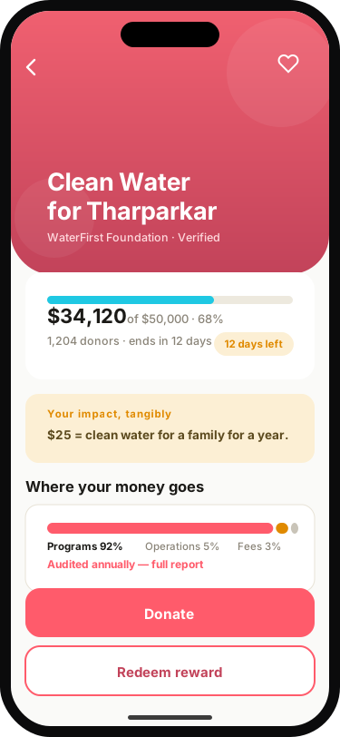
- Tangible details drive donations. Across three experiments (Organizational Behaviour and Human Decision Processes), describing a charity's interventions in concrete detail increased donations — because donors believed their generosity could actually affect the problem. Design implication: show impact concretely, not abstractly.
- Generosity cascades. Research on social networks (Cooperative Behaviour Cascades in Human Social Networks) found one generous act can inspire generosity three degrees removed — a single person influencing dozens they've never met. Design implication: make giving social and visible.
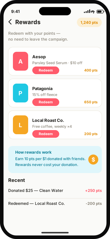
Those two principles — transparency of impact and social mechanics — became the concept's backbone: partner with friends, team up with brands for social good, and earn rewards that reinforce the habit.
03 Defining the user
I worked from a proto-persona, Saadia — a Chartered Accountant who wants the altruistic feeling of helping, but is wary of how much of a donation disappears into administration and operational costs. She's looking for a platform that shows exactly how funds are deployed while maximizing impact.
I'll be direct about the constraint: my interview sample was 5 people from similar backgrounds and beliefs — not representative of all donors. Rather than dress that up as validated personas, I used a proto-persona explicitly and let the behavioral literature carry the generalizable weight. Naming your evidence limits is part of doing research honestly.
04 Exploration
Journey mapping first, then sketches and crazy-8 exercises to explore broadly before converging on a lo-fi prototype for testing. The core flows: discovering causes, starting a donation, tracking impact, and redeeming rewards.
05 Testing — where the design broke
I ran unmoderated usability testing with 7 participants (ages 25–60, each donating to charity at least twice a year) against the core flows. The results were humbling in the best way — they found real breaks:
Critical findings
- 3 of 7 participants tapped "favourite causes" instead of "donate now" when asked to start a donation. They eventually completed the goal, but the detour added 2 extra steps and real confusion — the primary CTA wasn't reading as primary.
- 4 of 7 struggled to navigate to a campaign and back to redeem a reward — a critical error for 2 of them. The redemption flow required users to know they had to go back a page; they didn't.
06 Iteration
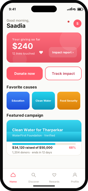
Both fixes were structural, not cosmetic. For the donation flow, I redesigned the home page around two unmistakable primary actions: begin a donation, or track a donation's progress — no competing labels, no ambiguity about where to start. For rewards, I added redemption directly inside the campaign page, so users never have to navigate away and back to complete the task. In-context actions beat navigational ones.
The hi-fi design carries a high-contrast visual style to WCAG 2.1, with the home page rebuilt around the donation flow — the product's most critical functionality — and transitional animations that make pop-up menus feel responsive and alive.
07 Outcome & reflection
Sharity landed as a validated concept: a donation flow users can start without hesitation, impact tracking that answers the trust question, and a reward system that survived contact with real users. The two critical errors found in testing were designed out, not documented away.
What stayed with me: secondary research is a legitimate design material — behavioral findings gave this concept a spine that pure intuition couldn't. And the proto-persona decision reinforced something I still practice: be explicit about what your evidence can and can't support. It makes the work more trustworthy, not less.