01 The problem
Restaurant owners and managers run their kitchens on a patchwork: recipe cards, Word documents, and consumer apps — none of them built for managing menus or sharing work across teams and locations.
The failure modes were concrete. Documents are hard to keep updated in a team setting. Recipe apps aren't set up for menu management or team sharing. Physical cards deteriorate and can't be shared. And when a recipe changes, getting the update to everyone who needs it is a slow, manual process — which means locations drift out of sync and quality suffers.
This wasn't a crowded space with an obvious incumbent to out-execute; it was a genuine gap in the food industry. The design question I set: how might we make it easier for restaurant owners and managers to save and share recipes — and roll out menu changes across multiple locations?
02 Research
I conducted 7 user interviews with restaurant owners and managers. I chose interviews deliberately — the problem space was unfamiliar enough that I needed follow-up questions and the freedom to chase unexpected threads, which a survey couldn't give me.
Key insights
- Fragmented tooling is the norm. Every participant used multiple methods to save or share recipes — no single tool covered the job.
- Loss is universal. All participants had lost recipes to physical or technical failure — worn-out cards, crashed apps, broken devices.
- Recipes are living documents. Users needed a way to attach notes to recipes — what worked, what didn't — so knowledge accumulates instead of evaporating.
03 Defining the user
I synthesized the interviews into a primary persona — Dantae Rodriguez, 25, who owns and operates two food trucks in downtown Vancouver. He constantly creates new dishes, documents them on recipe cards that get misplaced or torn, and struggles to keep both kitchen teams updated when recipes change. I also drafted a secondary persona for large-scale food business operators, but deliberately scoped the project to one user — a sharper problem beats a broader one at concept stage.
A journey map of the menu-rollout process then exposed where the current patchwork breaks down: the handoff moments, where updates stall and versions diverge.
04 Exploration
After a mood board for visual direction, I sketched multiple variations of each screen from the task flow — then pulled the strongest elements from each into a digitized lo-fi prototype. The discipline here was divergence before convergence: explore broadly, commit late.
05 Testing & iteration
Before refining anything, I ran an unmoderated usability test (Maze) against the lo-fi prototype, structured around five research questions:
- How long does it take a user to find a recipe and share it with the kitchen team?
- Can users successfully locate the recipe they want?
- What can the paths users take reveal about the search process?
- Where do users get stuck while searching?
- Is the recipe-sharing process itself easy?
What testing surfaced
- Users wanted a cleaner home page — less scrolling, clearer navigation.
- The ingredient-order page needed clearer microcopy about what to do.
- Users asked for shopping lists generated from the app and a way to favorite recipes — both became features.
- A critical error: the hamburger menu occasionally failed to open — fixed before hi-fi.
Iterations were direct responses to evidence: a simplified home page with a category menu that cut clutter, a slide-out nav with favorites and preferred vendors, and instructional microcopy on the ingredients page ("select items you want to order").
06 High-fidelity & accessibility
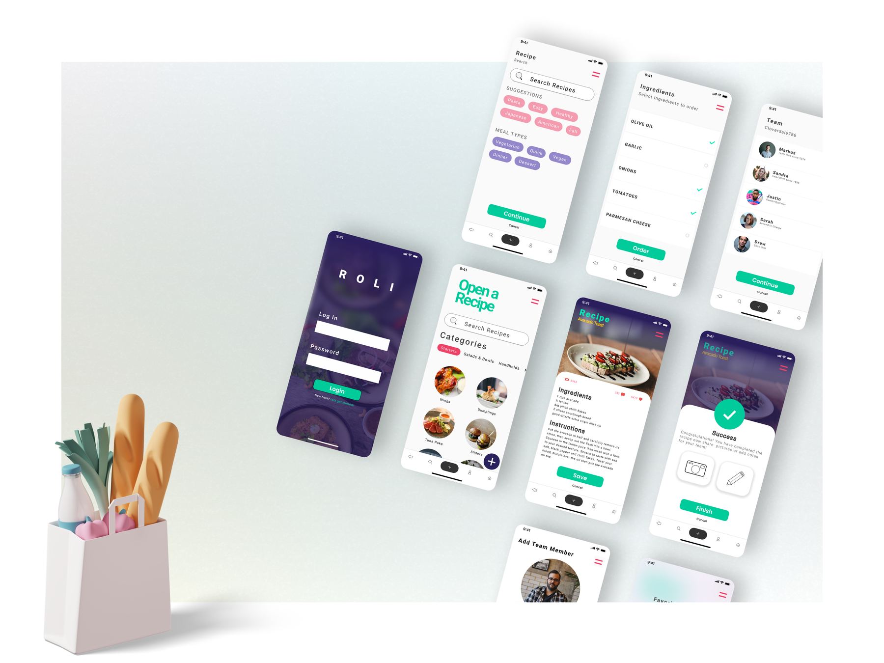
The hi-fi design follows a fresh, high-contrast visual style built to WCAG 2.1 from the start. This is where the project taught me its sharpest lesson: my original accent — a bright green with white text — looked vibrant but failed contrast for users with visual impairments. I went back and darkened it, and the experience got better for everyone. Accessibility as a constraint made the design stronger, not duller.
07 Outcome & reflection
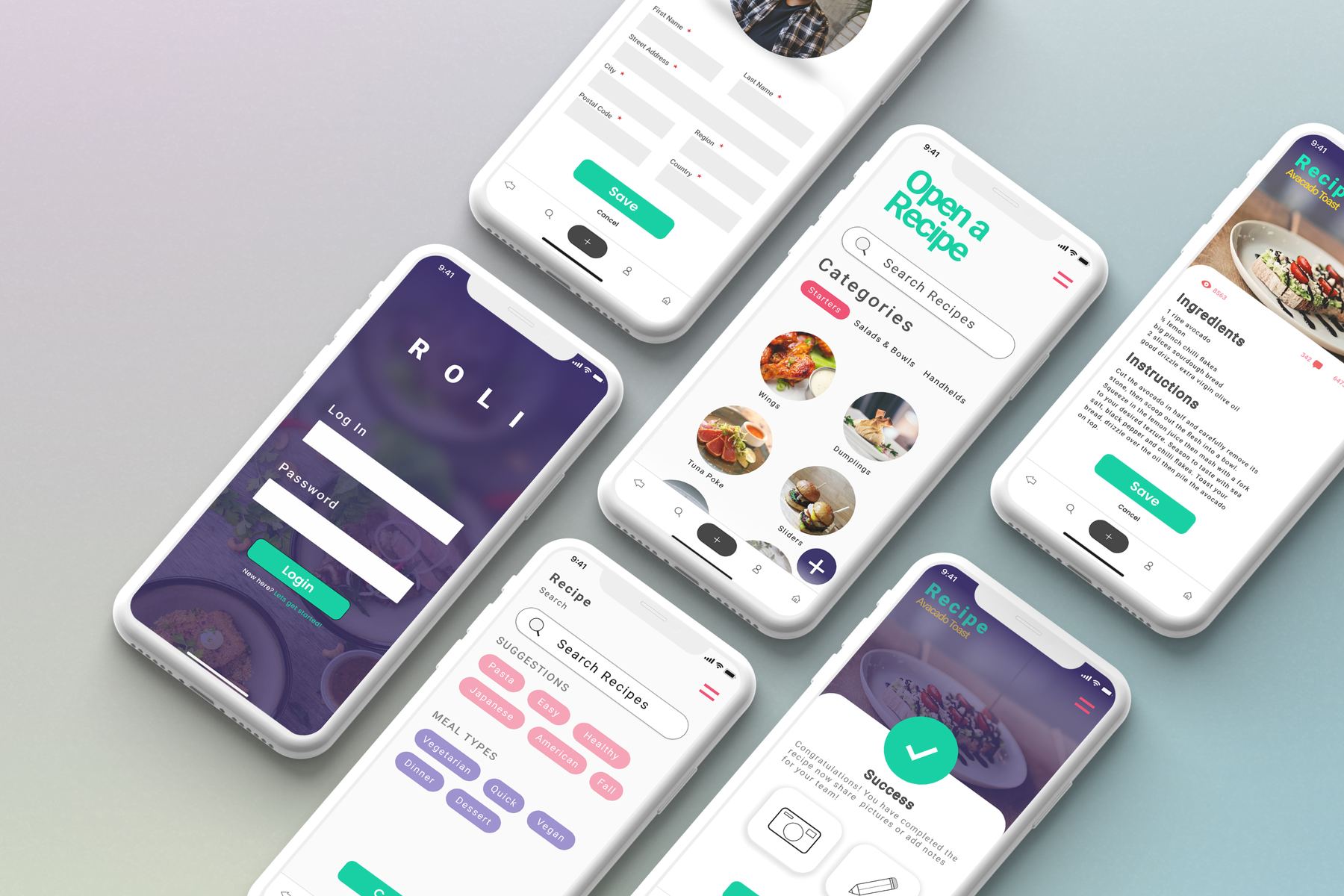
Roli shipped as a tested, iterated hi-fi concept: a shared recipe system where owners can store recipes with notes, organize them by category, share across locations, and generate shopping lists — with favorites and vendor management shaped directly by user requests.
What I'd carry forward: interview first when the domain is unfamiliar, scope the persona set ruthlessly, and treat contrast ratios as a design material rather than a compliance checkbox. The deepest lesson was about multi-user systems — designing for one cook is easy; designing so five locations stay in sync is a systems problem, and that's the work I want to keep doing.