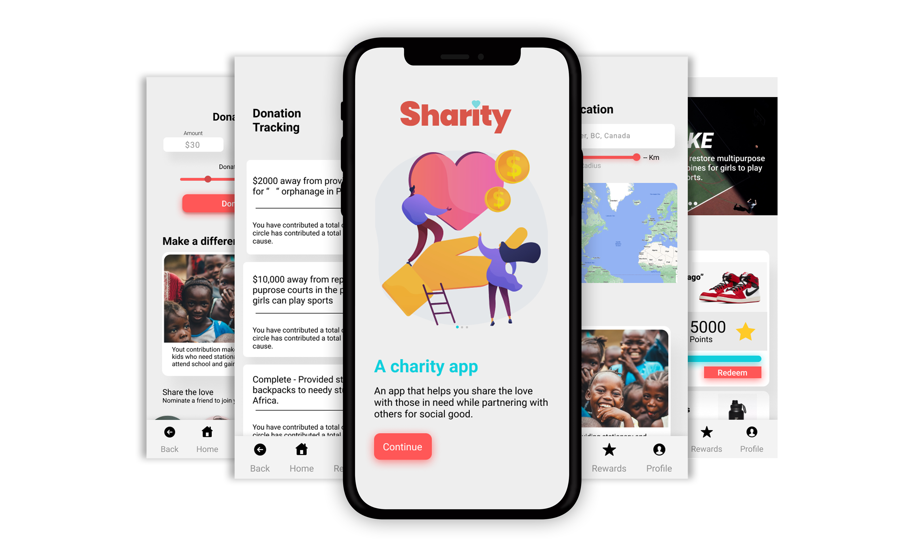
Meet Sharity
A platform that allows its users to donate to charity easily while maximizing the impact they have towards helping those in need by rewarding you for partnering with friends and big brands for social good.

Design Process

01. Empathize
What was the problem?
There are many reasons someone might not donate to charity or even stop donating. The top 3 reasons include:
1) Personal financial challenges
2) Poor communication (not seeing the result of their donation)
3) Lack of trust in the charity (lack of transparency and as a result unsure of if their donation will make a tangible difference)
These concerns kept coming up throughout my research and begged the question: "How might we design a platform that makes it easy for people to donate to charity without taking on too much of a financial burden, and keep motivated to continue to donate while making a real difference for the causes they support?"
Secondary Research
I researched online to try and understand what encourages people to donate to charity and keeps them donating regularly.
According to an authoritative report, "Organizational Behaviour and Human Decision Processes", across 3 separate experiments, adding tangible details about a charity's interventions increased donations because these details increased the participant's belief that their generosity could have an impact on a particular problem.
According to another study "Cooperative behaviour cascades in human social networks", generosity can cascade through social networks. Researchers found that a generous act by one person could inspire generosity in someone three degrees removed from them, this showcases how a single person can influence dozens or even hundreds of people in their social network including people they have never even met.
02. Define
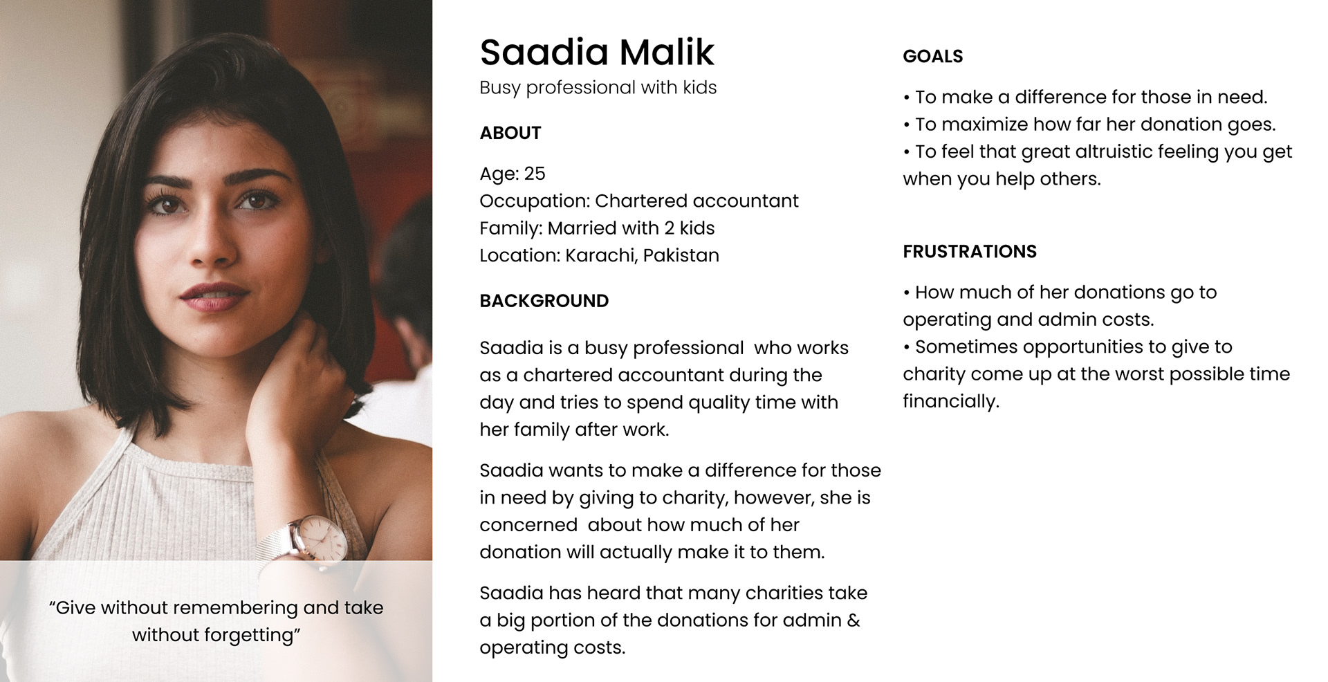
Proto-Persona
I created Saadia to represent the type of users who I expect to use this platform. I chose to use a proto-persona because of time constraints, I could not get a big enough sample size to get an accurate representation of all people who donate to charity. I had interviewed 5 people who were all from my community with very similar backgrounds and beliefs and I recognized that this would not provide an accurate representation of the population.
Saadia is a Chartered Accountant from Karachi, Pakistan who wants the altruistic feeling of helping those in need. She is very wary of how she gives to charity as she feels a lot of the donations tend to go into a charity's administration fees and operational costs.
Saadia is in search of a platform that provides transparency of how all funds are deployed while maximizing the impact for those who need help.
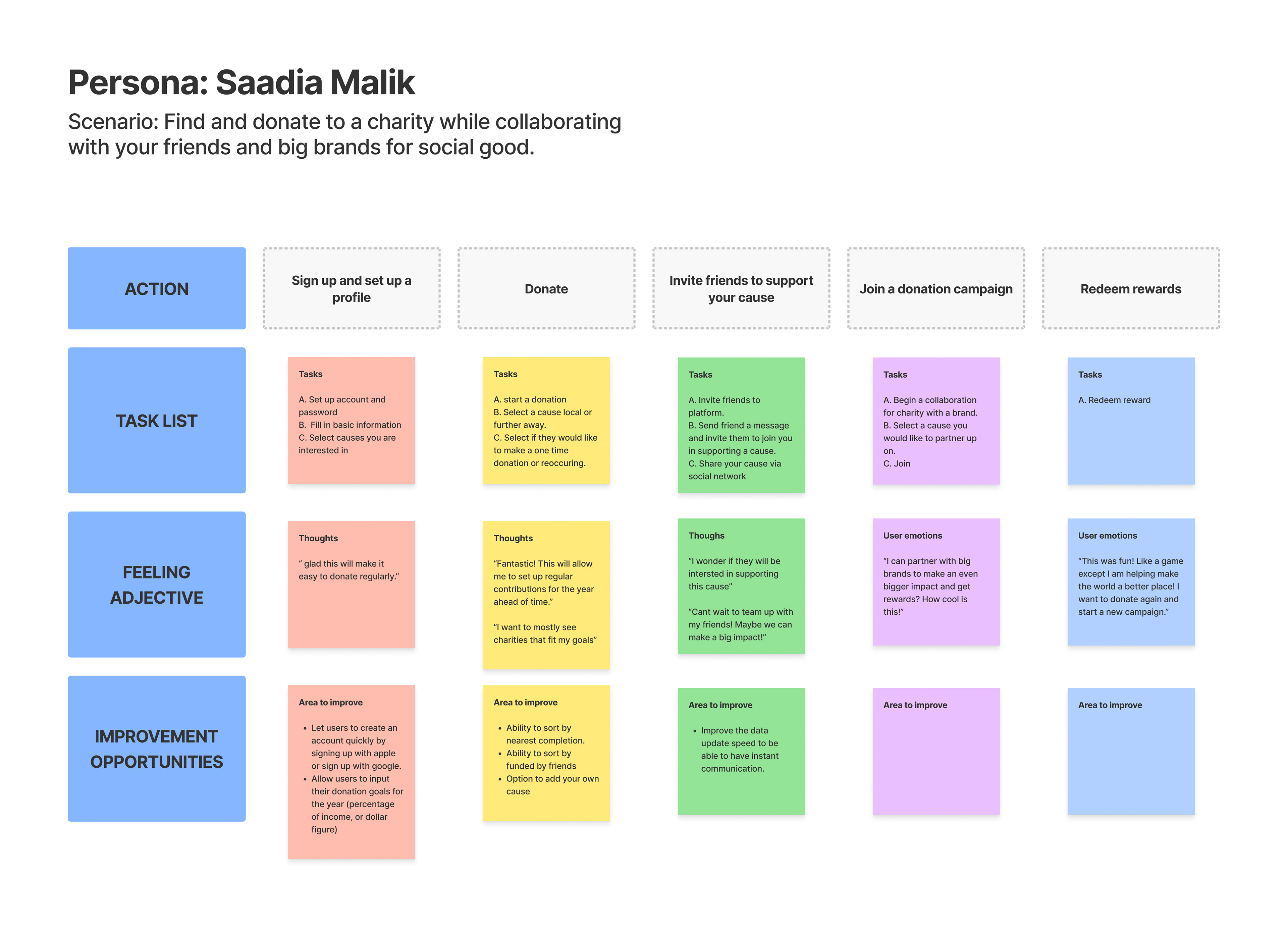
Journey Map
03. Ideate
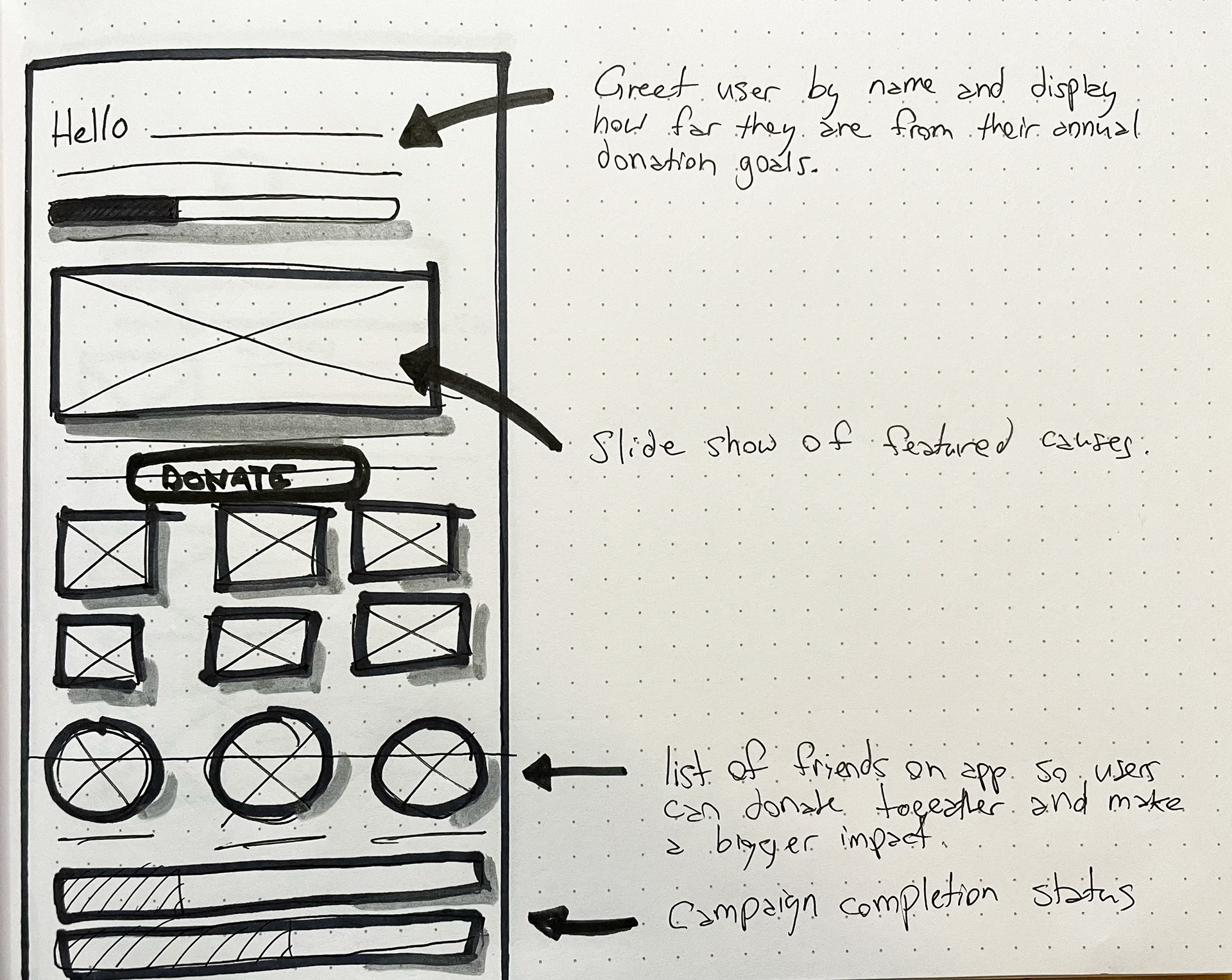
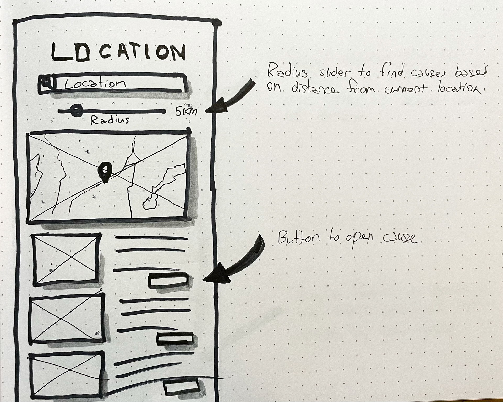
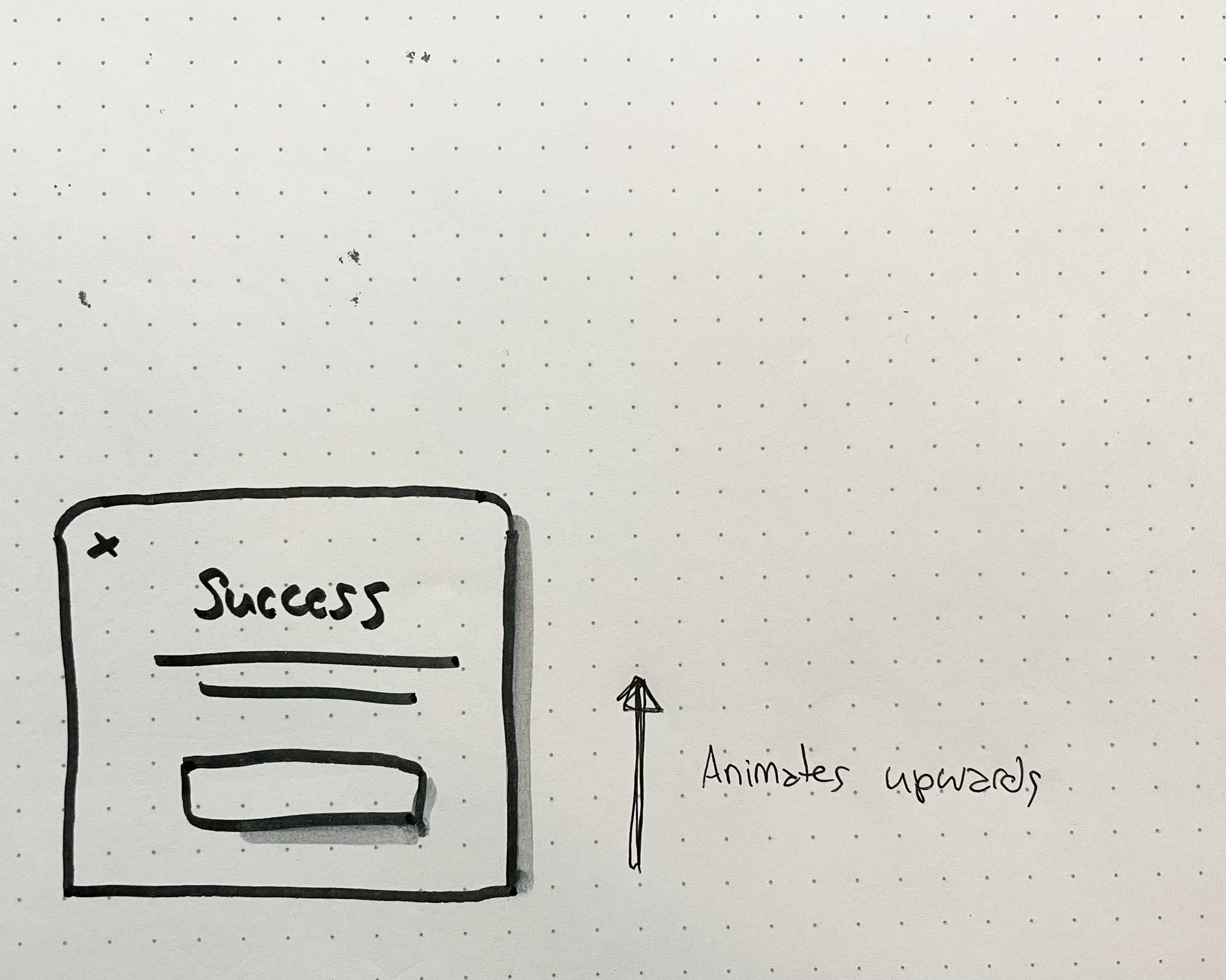
Sketches
After creating a mood board for inspiration I sketched multiple variations of each screen from my task flow and selected my favourite elements from each one for my digitized lo-fi prototype. Check out some of my very rough sketches below.

04. Prototype
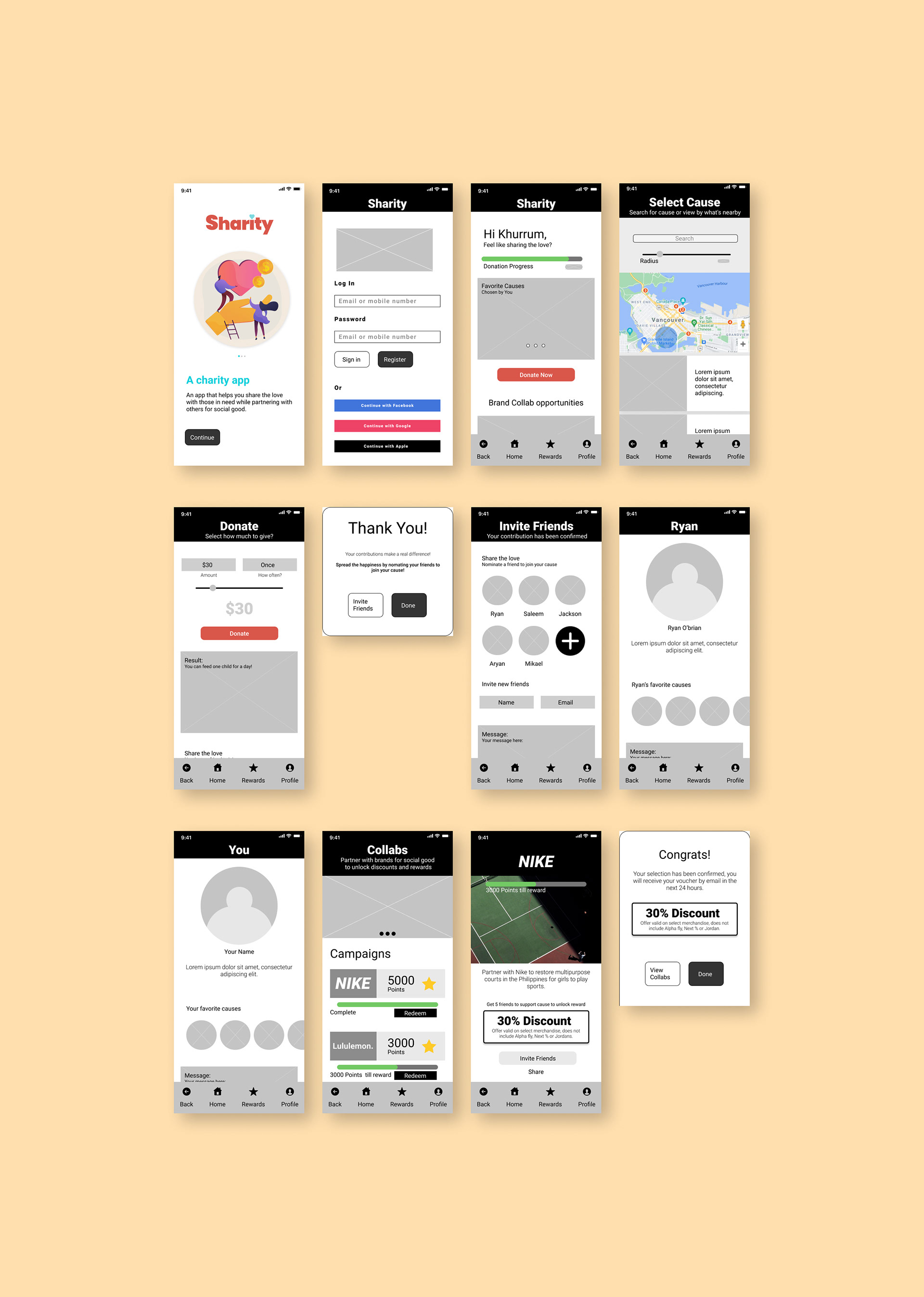
Lo-Fi Prototype
After selecting my favourite elements from the crazy 8 exercises I completed I designed a low fidelity prototype for the purpose of conducting usability testing.
05. Test and Iterate
User testing
Before launching the product, I conducted unmoderated usability testing with 7 participants between the ages of 25 and 60 who donate to a charity at least twice a year.
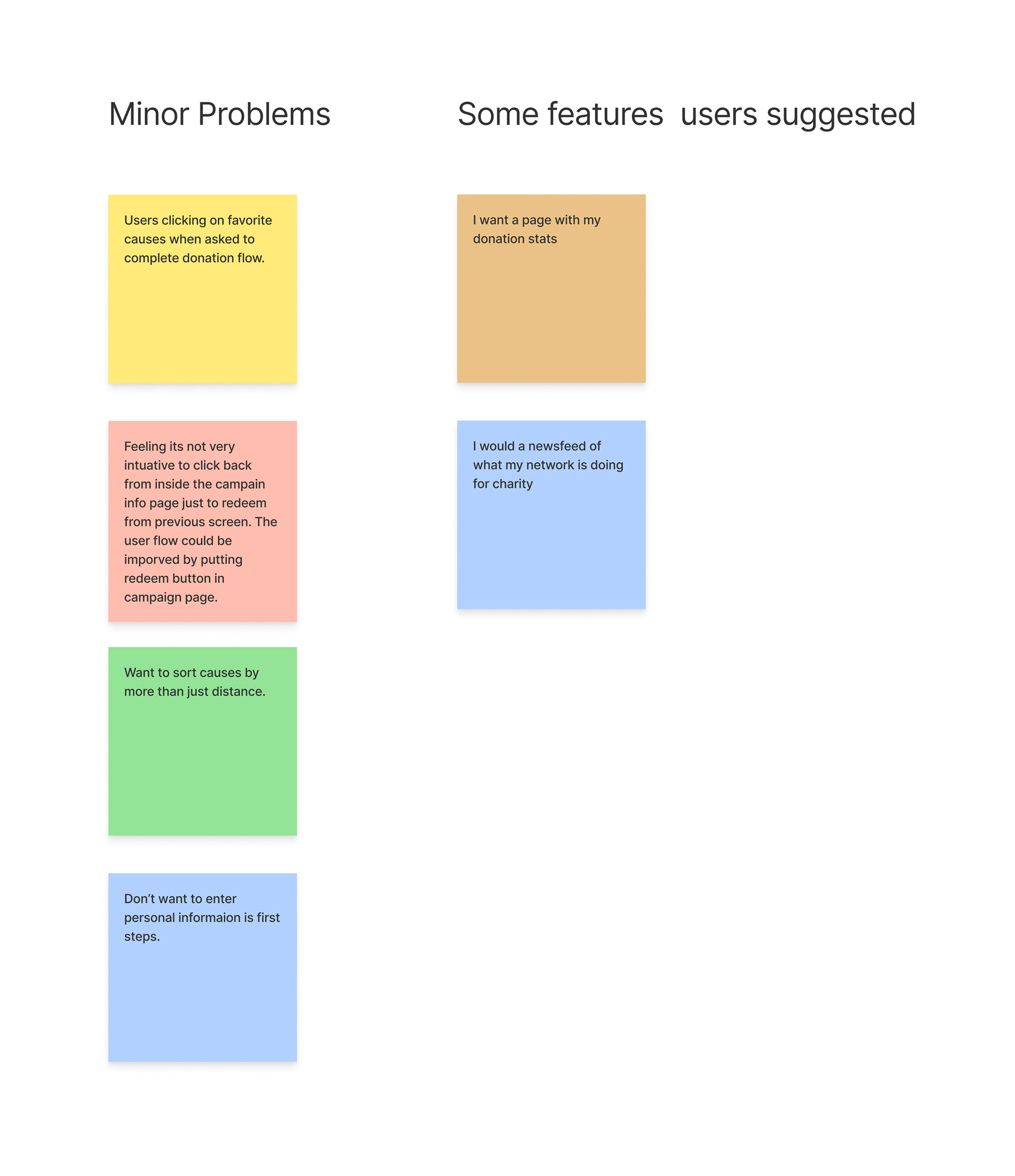
Insights
3 out of 7 total participants selected the favourite causes button instead of the donate now button when asked to initiate the donation flow, although they were still able to complete the goal this way it added 2 extra steps and made the process more confusing.
Users want a simpler flow for initiating a donation flow.
4 out of 7 total participants had a difficult time navigating to a campaign and then going back to the previous page to redeem the reward, this presented a critical error for 2 out of the 4 users.
Users want a more straightforward way to redeem rewards.
Iterate
Using the valuable insights we uncovered from the user testings I made iterations to my initial design.
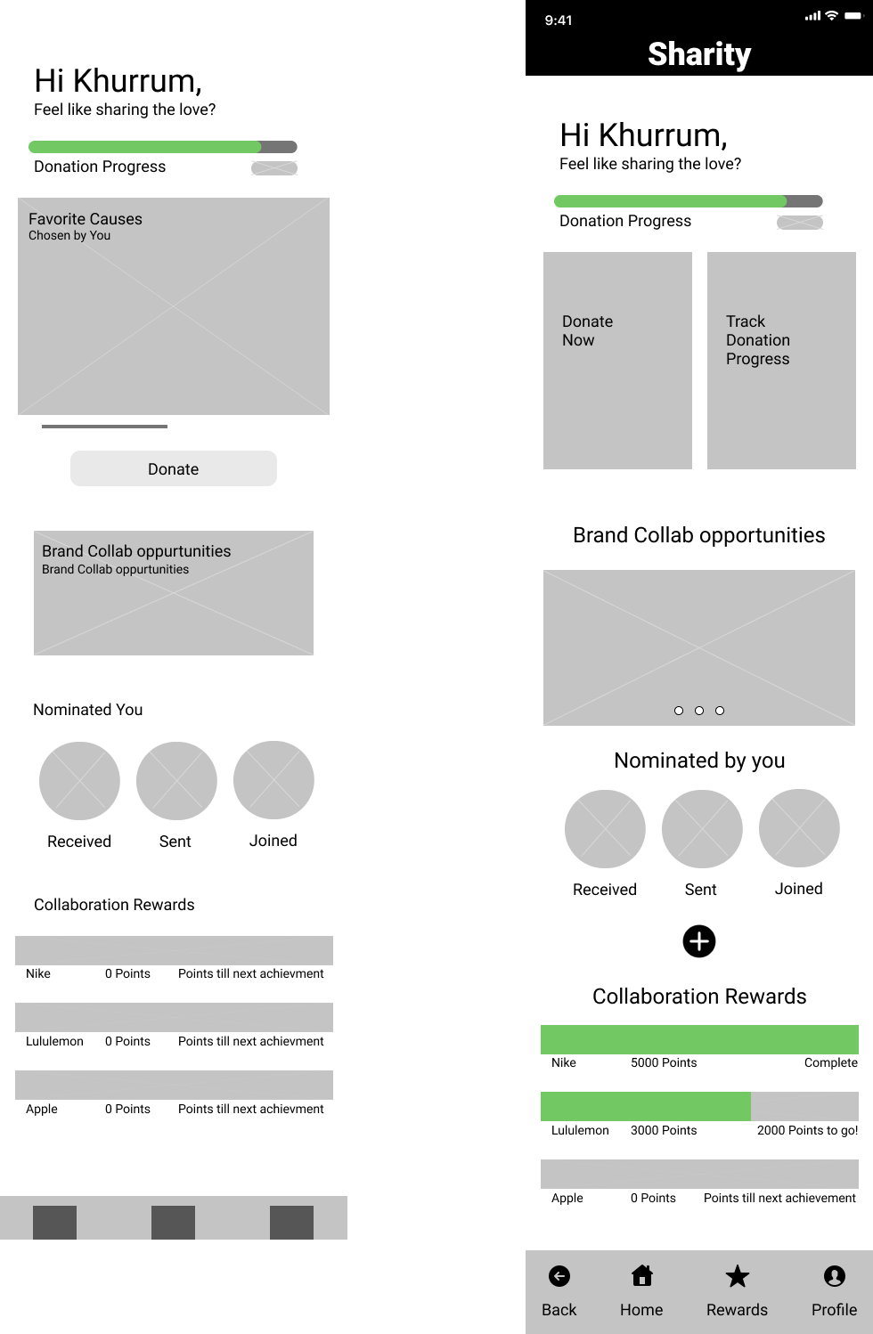
Users were unsure of how to begin the donation flow and kept trying to start a donation by selecting "favourite causes". To simplify this task I iterated on my design by creating two main buttons, one to begin a donation and one to track the progress of a donation.
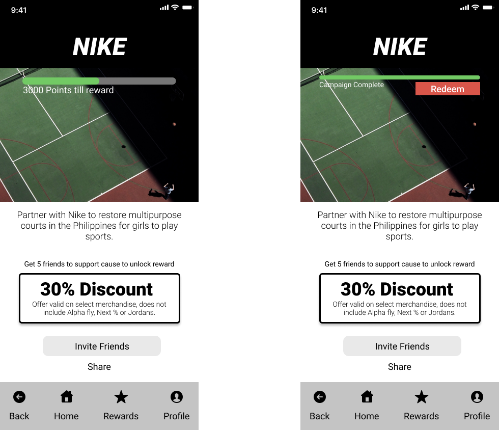
Users were unsure of how to redeem rewards from within the campaign page. To make it simpler to complete this core task I added a redemption button within this page.
Hi-Fi Prototype
Once I tested and finished making iterations on my digital wireframe, I started building a Hi-Fi mockup. I followed a high-contrast visual style to maximize readability and comply with WCAG 2.1 guidelines. I have redesigned the home page to make it much easier to begin the donation flow which is the most key functionality of this app. I have modified the reward page to include the ability to redeem a prize from within a campaign page to address the critical error some users faced when they did not know they were required to go back to a page to redeem.
What I have learned
During this project I learned about how to create a more accessible UI through the use of colours and contrast. I also learned how to use transitional animations to create more interactive pop up menus.