Meet Roli
A platform that allows restaurant owners and managers to quickly and easily store and share recipes while streamlining the time-consuming steps of implementing new menus across multiple locations.
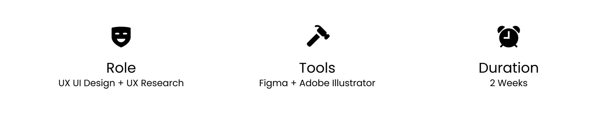
Design Process
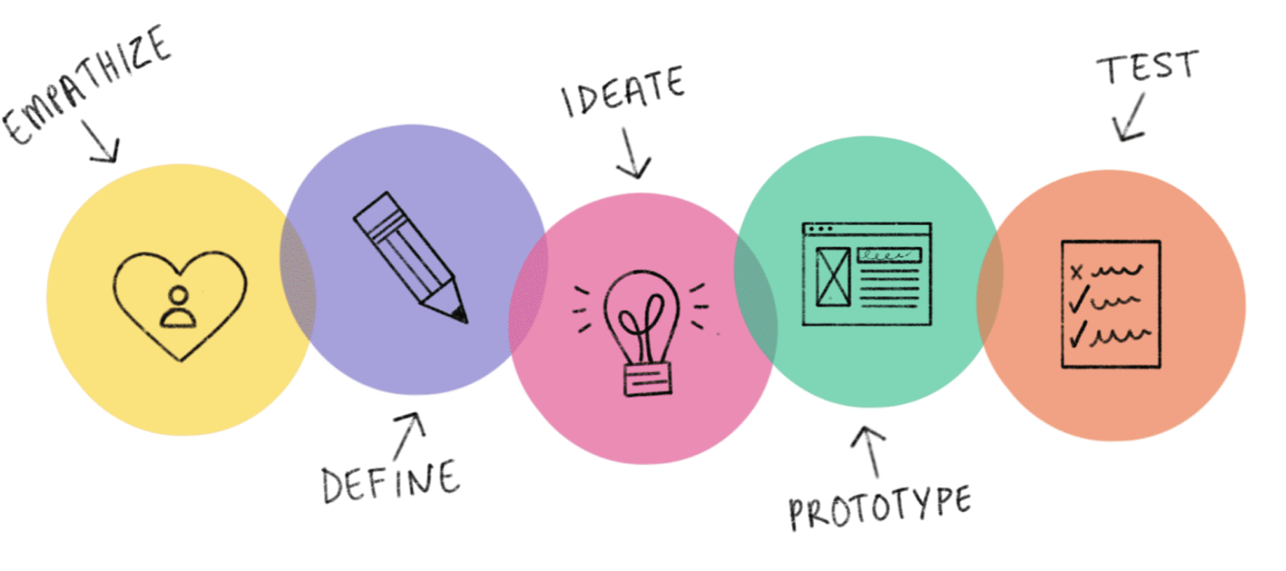
01. Empathize
Overview
Restaurant owners and managers have to resort to a combination of recipe cards, word documents and consumer apps which lack the features required to speed up and streamline the recipe storing and sharing processes.
The current solution posed the following problems:
1) Word documents on their own are difficult to keep updated in a team setting.
2) Recipe apps are not setup for managing menus or sharing across teams.
3) Recipe cards deteriorate and are difficult to share across teams
4) When a recipe is updated its hard to get the update to everyone who needs it (very manual process)
With this huge gap in the food industry and no real app competitors I began to ponder, "how might we make it easier for restaurant owners and managers to save and share recipes".
Primary Research
I conducted 7 user interviews to get a better understanding of the problem. I chose interviews as my primary research because it allowed me to better understand the user needs by asking follow-up questions to get insight on the kind of solutions they need.
Insights
- Target users are using multiple methods to save or share recipes.
- All users have lost recipes due to some sort of physical or technical failure (cards wearing out, computer/phone issues, apps crashing, etc.)
- Users need a way to add notes to recipes so they can refer back to them in the future for what worked well and what didn't work so well for them.
02. Define
Primary Persona
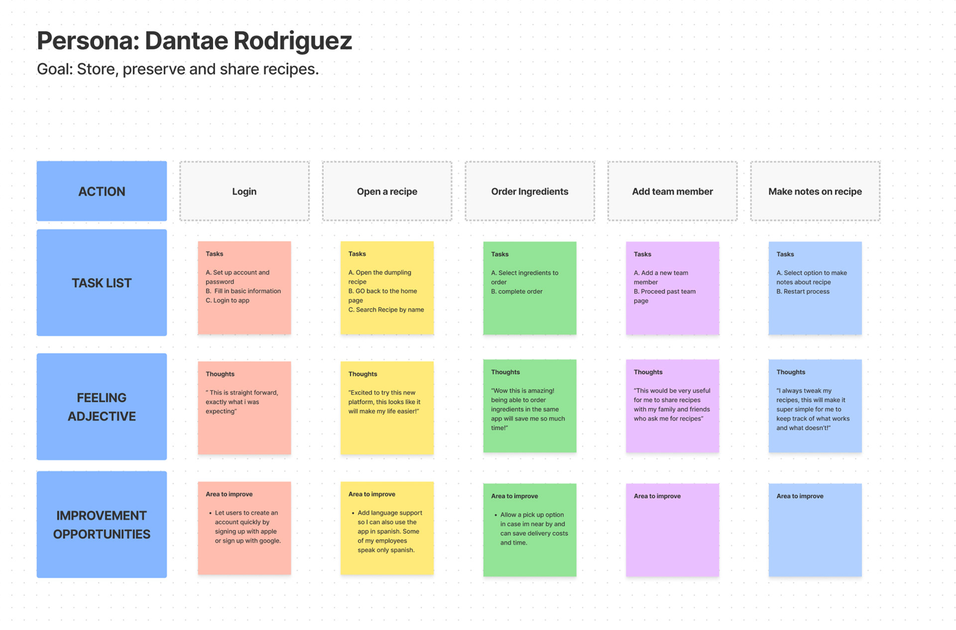
I created Dantae to represent the pain points, motivations, and behaviours found in my interviews. Dante is a small restaurant owner that is always trying to keep his restaurant menu fresh and exciting, he often struggles to remember and document his new creations. He often writes new recipes down on cue cards however they quickly get worn out or lost. Dante also wants to share his recipes with his other locations but finds it very tedious to keep his team up to date with new recipes and improvements he's made to recipes.
I created a secondary persona of a large-scale food business owner, but for this project decided to focus on only one user.

Journey Map
03. Ideate
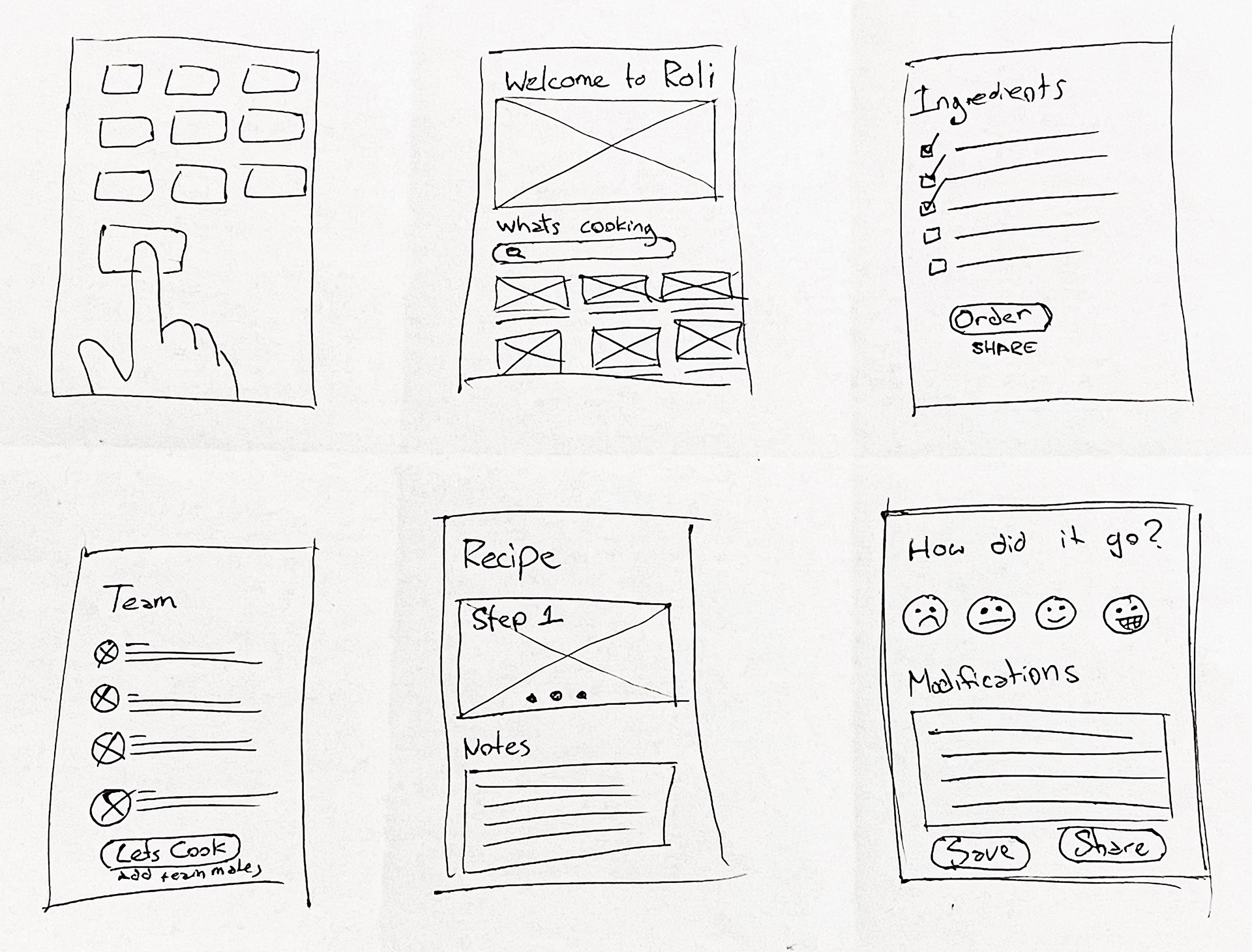
Sketches
After creating a mood board for inspiration I sketched multiple variations of each screen from my task flow and selected my favourite elements from each one for my digitized lo-fi prototype. Check out some of my very rough sketches below.
04. Prototype
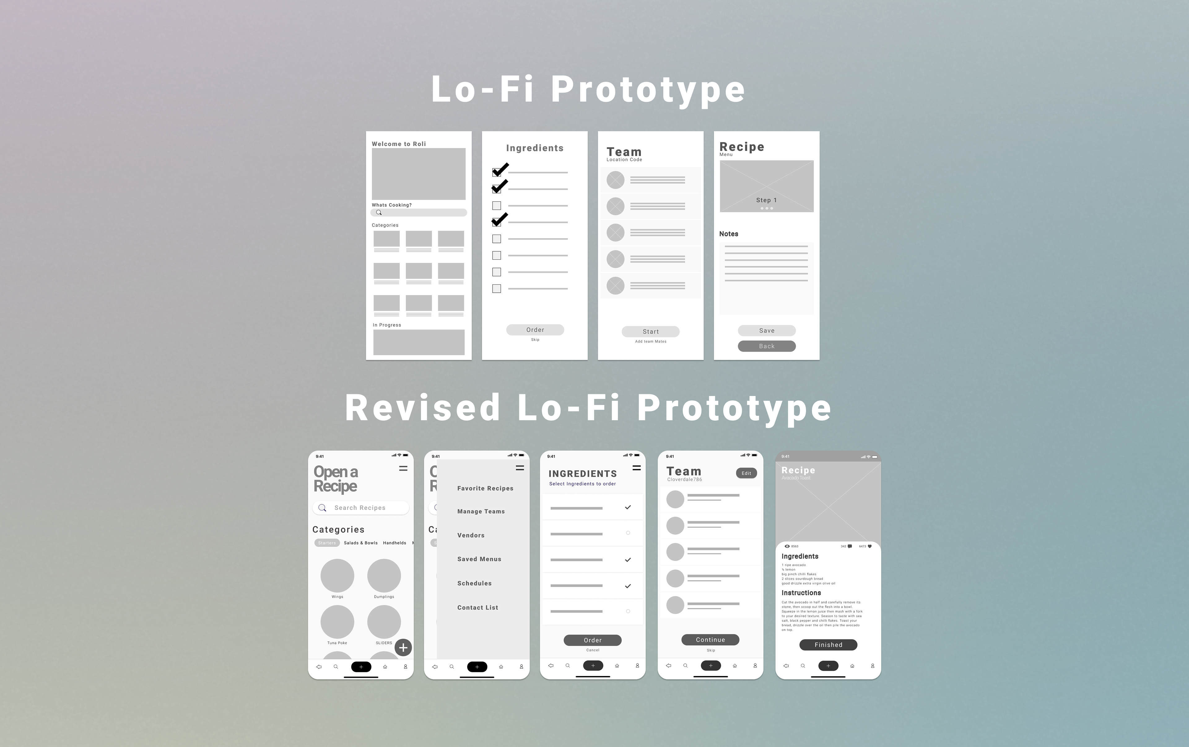
Lo-Fi Prototype
With the insights I uncovered, I reiterated my design. I simplified the home page but added a category menu that allows only relevant recipes to be displayed, this drastically reduced clutter and made this page much easier to navigate. In the slide-out navigation bar, I added options for adding favourite recipes and an option to add preferred vendors. On the ingredients page, put a small line of text asking the user to select items they want to order to make the page easier to understand.

05. Test and Iterate
Usability testing
Before launching the product, I conducted an unmoderated usability test through Maze.co to gain insight on how easy my platform was to use and what parts needed to be adjusted to increase ease of use and efficiency.
Research Questions
1. How long does it take for a user to find a new recipe and share it with the kitchen team?
2. Are users able to successfully locate the recipe that they want?
3. What can we learn from the steps users took to locate a recipe?
4. Are there any parts of the recipe search process where users are getting stuck?
5. Is the recipe-sharing process easy for users?
Insights
- Users want the home page to look cleaner and easier to navigate without too much scrolling.
- Users want the Ingredient order page to be more clear.
- Users want a way to create shopping lists right from the app.
- Users occasionally had critial error when opening the hamburger menu.
- Users want to be able to favorite recipes.
Iterate
Using the valuable insights we uncovered from the user testings I made iterations to my initial design.
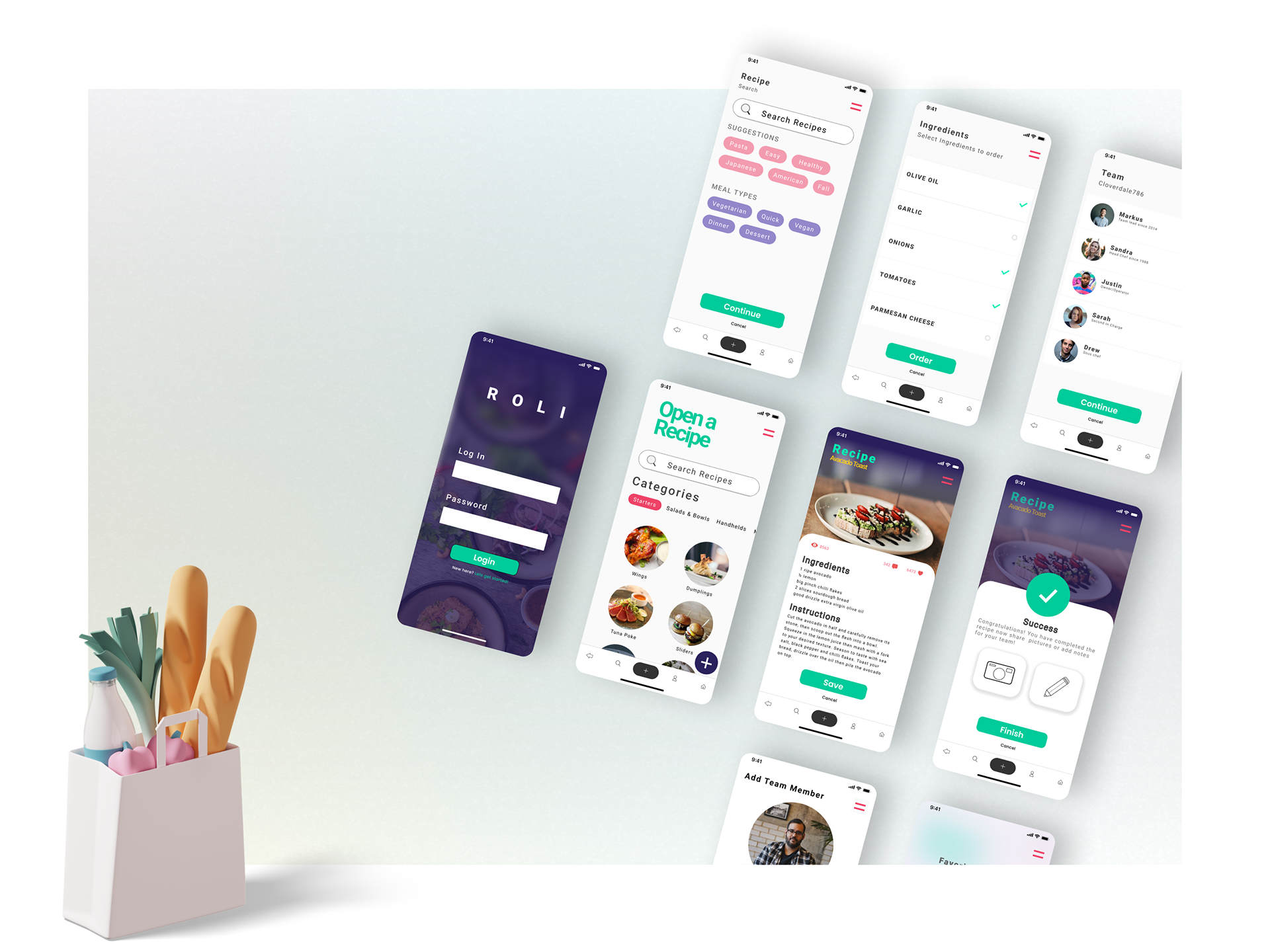
Hi-Fi Prototype
Once I tested and finished making iterations on my digital wireframe, I started building a Hi-Fi mockup. I tried to follow a fresh high-contrast visual style to maximize readability and comply with WCAG 2.1 guidelines. This mockup really implements all the user insights I received from my UX research effectively.

What I have learned
During this project, I learned about contrast and the use of colour to create more accessibility within my designs. I initially used a very bright green for my accent colour and buttons with white text but quickly learned this could make it difficult for those with visual impairments from having a good experience with my app and so I went back and changed it to a darker colour to increase colour.